Realme today introduced a brand new user interface which it claimed has been designed keeping in mind the aspirations and desires of the new generation, the company’s primary clientele. Realme also described the new look of its user interface as one that defines ‘Seamless Fun’, something that also identifies well with the new gen user base.
App icon personalization.
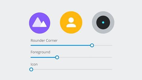
Primary among the changes introduced with the new UI include the use of new colours and design which the company claims will not only make thing look fresh but will also add to user convenience as well. For instance, there is the new icon customization feature which you can use to change the way the app icons look. With this, not only do you get to change the size and shape of the icon but the internal icon design too can be customized to suit personal tastes.
Icons now more realistic.

The looks of some of the icons too has gone for a makeover, which Realme claims will make it more appealing to the users. The company also stated they have relied more on items that you are likely to see around you on a daily basis to define the app icons. Take for instance the Settings icon which continues to mimic the shape of the gear parts but now depicts the infinite circles as per the golden ratio, which Realme claims is what gears in real life depicts in any case.
Other enhancements: Better security, Convenient screenshots & New Focus Mode.
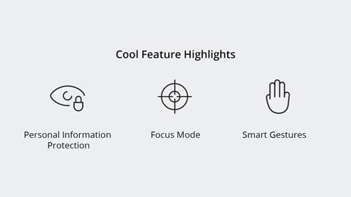 Another important feature that happens to be the hallmark of the new Realme UI is its adherence to more strict safety and security standards. That comes in the form of the new ‘Personal Information Protection’ feature which aims to restrict the amount of data that any app might seek of you. For instance, any app requesting your personal info such as your call details, contacts, messages, schedules and such will only be presented with a blank page.
Taking screenshots is also easier now than ever before. For this, while the three-finger swipe method is still applicable, you can now define the area of which you need a screenshot. This way, you will be saved from having to crop the images later on.
Then there is the new Focus Mode too which will let you concentrate on the tasks you are onto at the particular moment of time. While the system will help maintain your focus by shutting the world out from you, there will also be some soothing music played back to help you maintain your focus. How that works out in real life is something that remains to be seen though.
Smoother animations, new wallpapers.
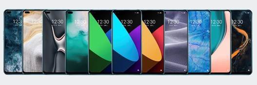
Among the other useful bits that the new Realme UI incorporates include quantum animation engine to allow for smoother animations and screen transitions. There are 11 cool new wallpapers introduced too which Realme said has been inspired by nature.
Backward compatibility, more refines UI.
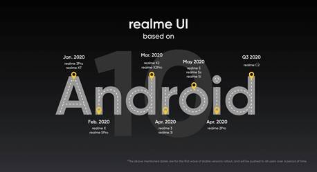
It being built around the new Android 10 has its own positives. That includes a light and fast experience that is also closer to the stock Android in its feel than any time before. It is less frugal on power too while being backward compatible with all past Realme handsets, thereby offering a fresh and refined feel to all.


