Google has been busy tinkering with its AI-powered search tool, Circle to Search, and the latest development reveals a significant UI redesign. This “toolbox” approach aims to streamline the user experience and provide quicker access to a suite of functionalities. But what exactly is changing, and how will it impact your search experience? Let’s dive in.
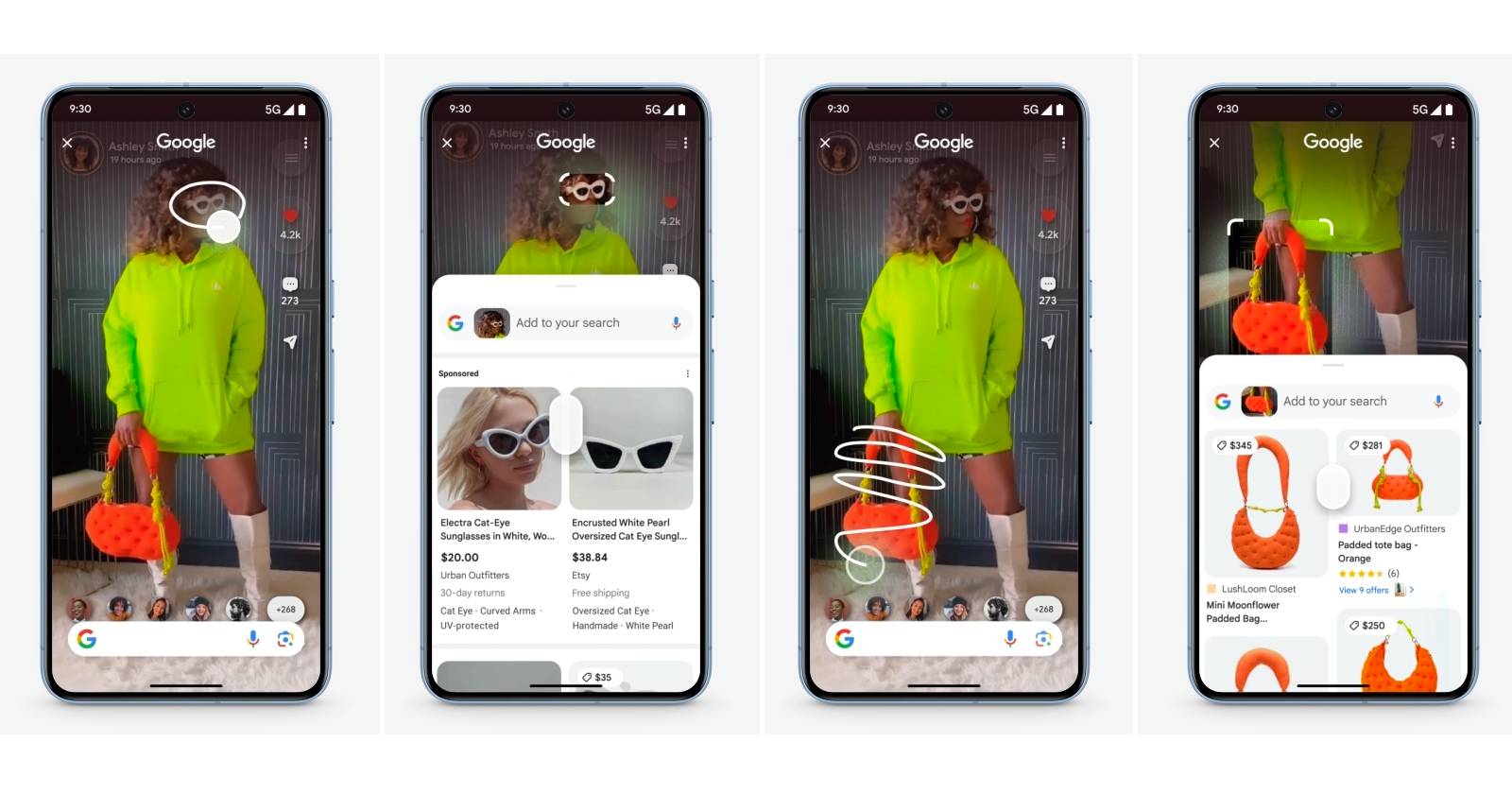
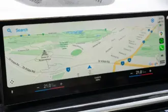
Circle to Search, first introduced on the Galaxy S24 series and Pixel 8 series, allows users to initiate searches directly from any screen. By simply circling an element on the display, users can trigger a search query without leaving their current app. While the feature has been lauded for its convenience, Google appears to be continually refining its design. This latest iteration, discovered within a recent Google app beta (version 15.45.43.ve.arm64), presents a “chunkier interface” with all elements housed within a rounded box, reminiscent of a toolbox.
What’s New in the Toolbox?
The most noticeable change is the introduction of a new button, akin to a traditional app drawer. This button, when tapped, reveals a compact pop-up menu containing various Circle to Search functions, including “Translate” and “Identify a song.” While this might seem like a minor tweak, it represents a shift towards a more organized and accessible user experience.
Key changes include:
- Consolidated Menu: Instead of having separate floating elements for search, music, and translate, all options are now neatly tucked away in the toolbox menu.
- App Drawer Button: The new app drawer button provides a clear visual cue for accessing the toolbox functionalities.
- Chunkier Interface: The overall interface has adopted a bolder, more prominent design, ensuring better visibility and ease of use.
Why the Redesign?
Google’s continuous experimentation with Circle to Search’s UI suggests a commitment to optimizing user experience. The toolbox approach likely aims to address several potential issues:
- Cluttered Interface: The previous design, with its floating elements, could potentially clutter the screen, especially on smaller devices.
- Discoverability: Some users might not have been aware of all the functionalities offered by Circle to Search. The toolbox makes these options more discoverable.
- Efficiency: By consolidating options within a menu, Google streamlines the interaction, potentially reducing the number of taps required to access specific functions.
My Experience with Circle to Search
I’ve been using Circle to Search since its debut on my Pixel 8, and I find it incredibly useful for quickly researching products, identifying landmarks in photos, and even translating text on the fly. The feature has become an integral part of my mobile workflow, saving me countless taps and app switches. While I appreciate the existing design, I’m eager to try out the new toolbox UI. The promise of a cleaner interface and improved discoverability is certainly appealing.
The Future of Circle to Search
This latest redesign is just one step in the evolution of Circle to Search. Google is likely to continue experimenting with new features and UI elements to enhance its functionality. Some potential future developments include:
- Customization: Users might be able to customize the toolbox menu, adding or removing functionalities based on their preferences.
- Search within Videos: Imagine circling an object in a video to instantly search for it online. This could be a game-changer for product discovery and research.
- Integration with Other Google Services: Deeper integration with Google Lens, Assistant, and other services could unlock even more powerful search capabilities.
Google’s dedication to refining Circle to Search underscores its commitment to innovation in the mobile search space. The toolbox redesign, with its focus on organization and accessibility, promises a more streamlined and efficient user experience. As Google continues to experiment and evolve this powerful tool, we can expect even more exciting developments in the future.


