Have you ever squinted at your screen, trying to log into your Microsoft account, wishing for a kinder, gentler experience for your eyes? Well, your digital prayers might just have been answered! Microsoft has quietly rolled out a significant redesign of its account sign-in user interface (UI), and the feature many have been clamoring for – a sleek dark mode – is finally a reality.
For years, the familiar blue and white login screen has been a constant presence across Microsoft’s vast ecosystem, from Windows and Xbox to Office 365 and OneDrive. While functional, its bright default setting could be jarring, especially in low-light environments. Now, Microsoft is ushering in a more modern, visually appealing, and crucially, eye-friendly era for accessing your digital life.
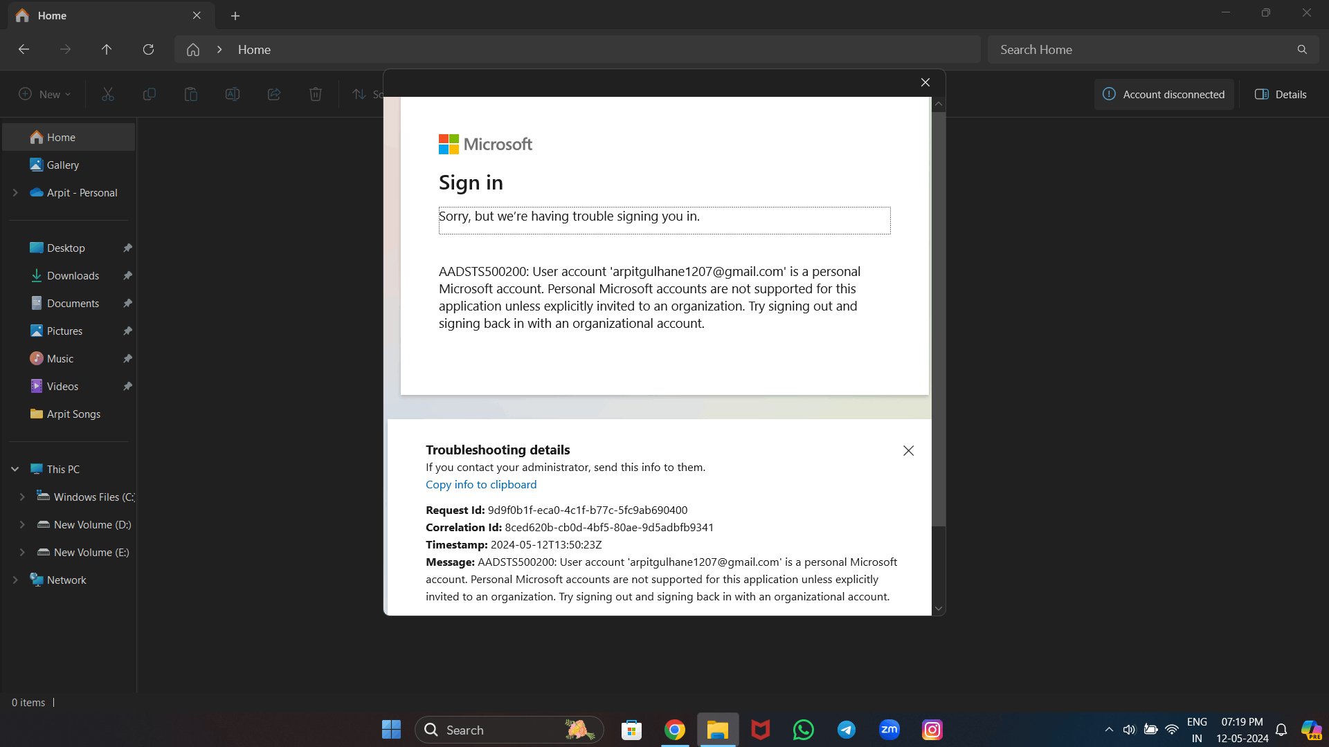
So, what exactly has changed? The update isn’t just a fresh coat of paint; it’s a thoughtful overhaul aimed at improving user experience and accessibility. The most immediately noticeable change is the introduction of a cleaner, more streamlined layout. Elements are spaced out more effectively, making it easier to focus on the task at hand – signing in. The overall aesthetic feels more in line with Microsoft’s Fluent Design System, offering a sense of visual harmony across their products.
But the real star of the show, the feature that has generated considerable buzz among users, is undoubtedly the long-awaited dark mode. Imagine logging into your account late at night, or in a dimly lit room, and being greeted by a dark, soothing interface instead of a blinding white screen. This isn’t just about aesthetics; it’s about reducing eye strain and improving comfort, especially for those who spend a significant amount of time interacting with technology.
The implementation of dark mode appears to be well-considered. It’s not just a simple inversion of colors. Instead, Microsoft has opted for a carefully chosen palette of dark grays and blacks, ensuring readability and maintaining visual clarity. Text remains crisp and legible against the darker background, and important elements like input fields and buttons are still easily identifiable. This attention to detail suggests that Microsoft has put genuine effort into making the dark mode a practical and enjoyable feature to use.
Beyond the visual refresh and the addition of dark mode, the updated sign-in UI also seems to incorporate subtle improvements to the overall flow. While the fundamental steps of entering your email, phone number, or username and then your password remain the same, the process feels smoother and more intuitive. Some users have reported a slightly faster loading time, although this might vary depending on internet connection and device performance.
This redesign isn’t happening in isolation. It reflects a broader trend across the tech industry towards providing users with more personalized and comfortable experiences. Dark mode, in particular, has become increasingly popular, with many applications and operating systems now offering it as a standard feature. Microsoft’s adoption of dark mode for its account sign-in UI aligns with these user expectations and demonstrates their commitment to modern design principles.
The rollout of this new sign-in experience seems to be gradual. Some users might see the updated UI immediately, while others might have to wait a bit longer. This phased approach allows Microsoft to monitor feedback and address any potential issues before a wider release. It’s a common practice for large tech companies when deploying significant changes to their core services.
For Microsoft users, this update brings a welcome change. It’s a visual improvement that also offers practical benefits, particularly for those who prefer dark interfaces or frequently log in under various lighting conditions. The cleaner layout and the introduction of dark mode contribute to a more pleasant and less visually fatiguing experience.
It’s important to remember that the sign-in process is often the first point of interaction with Microsoft’s services. A positive and user-friendly experience here can set the tone for the entire interaction. By investing in this seemingly small but crucial aspect of their ecosystem, Microsoft is showing that they value user comfort and convenience.
While Microsoft hasn’t issued a formal press release about this specific update, the changes have been widely reported by tech news outlets and observed by users across various platforms. This suggests that the rollout is indeed underway and impacting a significant portion of Microsoft’s user base.
So, the next time you go to sign in to your Microsoft account, be prepared for a fresh new look. And if you’re someone who has been longing for a dark mode option, get ready to embrace the darkness! This update signifies Microsoft’s ongoing efforts to refine and modernize its user interfaces, making the digital experience just a little bit better, one login screen at a time. Have you spotted the new design yet? What are your first impressions? Share your thoughts in the comments below!


