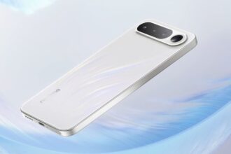
It was back in 2014 when we saw the first ZenFone – a device essentially aimed at as value for money offering. With a combination of a powerful spec sheet at a competitive price point, it was quite a success for a debut device. The ZenFone 2, did get some minor upgrades, most likely out of necessity to stay in the game, but again it was an awkwardly designed phone. Come 2016, and we see a drastic change with the new ZenFone 3. It sports a whole a whole new avatar, ditching its plastic roots with a premium metal body.
In a way, it marks a new beginning for the ZenFone series, representing the company’s vision of ZenFones of the future. But in the process, it might have drifted away from the value for money game. There’s no denying the ZenFone 3 is most premium looking ZenFone of the series. But at Rs. 27,999 for the 4GB RAM/64 GB storage variant, it’s out there to compete with killers which include the likes OnePlus 3 and the Xiaomi Mi 5. Has it got enough going on that makes it worthy of such a price tag, or for that matter, you’ll choose it over the OnePlus 3? Let’s find out:
Box Contents:
- ZenFone 3
- Fast wall charger
- USB Type C Cable
- in-earphones
- SIM Ejector Pin
- User Guide
Build and Design
The ZenFone 3 is certainly a remarkable improvement overs its predecessors in terms of design. It’s probably the best looking ZenFone out there, with its metal and glass body. Besides, the company has finally given the phone’s design elements a much-needed overhaul. It’s much slimmer, feels fairly good in the hand and looks premium. Volume rockers and power keys are seamless integrated on the right-edge. They’re easy to use and offer good tactile feedback.
That said, a few design elements still seem off the mark. First off, there is an awkward protrusion of the rear camera which is quite a turn-off. It doesn’t even help the phone to lay flat on a surface, making it prone to fall off a surface accidentally.
ZenFone 3 is most premium looking ZenFone of the series
Also, the bezels still seem rather chunky and fat, despite the company having shaved off a good few inches. As the ZenFone 3 feels rather big for one handed usage. It’s not the most comfortable smartphones to hold.
Besides, I’m not a big fan of the shiny metal frame as it looks a bit too gaudy and pseudo for my liking. That said, it’s not necessarily a bad thing as some users would rather prefer that sort of a finish.
Display
The smartphone gets a 5.5-inch Full HD display with a 401ppi pixel density. The screen looks sharp, has great viewing angles and is also non-reflective. It’s great to watch movies, play games, browse the web or edit documents and spreadsheets. Colour reproduction is also pretty accurate, and at the same not too overpowering on the eye.
They have a mellow tone to it, something I liked as its much easy on the eye. Though for some, colors onboard might not be as vivid and eye-popping as they would have liked. They are not as vibrant and punchy in comparison to the screen of the OnePlus 3.
Hardware and Performance
Under the hood, the device features a Qualcomm Snapdragon 2.0GHz octa-core processor bundled with Adreno 506 GPU. Our review unit had 4GB RAM and 64GB of onboard storage, which is further expandable by up to 2TB via microSD slot. Though with a Snapdragon 625 chipset onboard, it falls short of the competition as the likes of OnePlus 3 and Le Max 2 are home to the new Snapdragon 820, something usually reserved for flagship smartphones.
That said, the phone appears well equipped to handle basic usage and app switching. It zips through tasks such as web browsing, taking calls or playing multimedia files. Even while playing games like Subway Surfer and Fruit Ninja, it did not come across any lags or stutters. Besides, it also handles high-end games like Mortal Kombat X rather well. There were no jitters while in-game switching of menus or during actual gameplay, and the whole experience was smooth barring an odd lag that pops up occasionally.
Even the 50-magnet mono speaker housed at the bottom packs quite a punch, as it churns out fairly loud output levels. The fingerprint scanner housed on the back is also fairly quick and responsive, but not as good when you consider the phone’s asking price.
Overall, I had no complaints about the smartphone’s capabilities when it comes everyday usage. Call quality for both incoming and outgoings calls is crisp and clear, and I did not come across any calls drops during with the review unit provided to us.
As for synthetic benchmarks scores, the Asus ZenFone 3 racked up an Antutu score of 62411. While in GeekBench 4, the device pulled-off single and multi-core scores of 839 and 4039 respectively.
Another highlight of the ZenFone 3 is the performance of its 3000mAh battery. Despite not being that heavy, it surprisingly gave me over a day and a half of moderate usage. Light users can easily get around two days of usage with the ZenFone 3. While the standby time on this thing is just astonishing, the battery level doesn’t seem to budge if you leave the device untouched.
Also, it comes bundled with a fast charger and supports Quick Charge 2.0. With the bundled charger and the USB Type-C cable that comes with the phone, the phone gets about 50 percent juice in about 20-25 mins of charging – pretty impressive.
You get a hybrid dualSIM slot with the ZenFone 3. Other connectivity options include 4G LTE, Bluetooth, Wi-Fi, GPS, and GLONASS. There’s also a 3.5mm jack on top.
Software
The ZenFone 3 runs Android 6.0.1 Marshmallow bundled with the company’s ZenUI on top. You get key Android Marshmallow features such as Now On Tap, DND mode, improved memory management and so on. However, there’s an immense amount of bloatware on the phone’s interface, which makes the whole experience a bit too cluttered and clunky.
They say old habits die hard, and the company’s affliction towards bloatware can be seen on the ZenFone 3 as well. The phone comes pre-installed with unwanted apps, most of which cannot be uninstalled. Add to it that fact that some of them get continually updated and nag you with notifications, which can add to the frustration. Besides, they hog around 12GB out of the total 64GB of storage space. It’s a heavily morphed version of stock Android, and such clunky interface choices are likely to lead most Android purists going for something else.
That said, there are some customization options at your disposal such as the ability to tweak the app drawer and the Home Screen as per your requirements. Besides, even navigating around the phone’s interface feels smooth and free of jitters. But the company’s approach towards its UI is far from what you’ll call Zen-like. It seems massively bloated and can be a deal breaker for some.
Camera
The ZenFone gets a 16MP rear camera with f/2.0 aperture, laser auto-focus, OIS along with a dual-tone LED flash. Images taken from the rear camera look clean and detailed with punchy colors. Even photos captured in low-light manage to retain the sharpness and clarity. There’s also an in-built low light mode which when triggered, belts out even more detailed pictures in low-light. The f/2.0 aperture onboard certainly does the trick, which allows the camera lens to soak in more light. Furthermore, the optical image stabilization (OIS) ensures that shaky hand movement does not affect the overall sharpness and exposure.
The ZenFone 3 is also one of the few smartphones in the price range with 4K video recording capabilities. Here again, the OIS works like a charm as the video quality is pretty impressive. The camera is relatively fast, as you can take back to back photos in quick succession without the camera app showing signs of slowing down.
Even the phone’s 8MP front-facing shooter belts out fantastic selfies, with plenty of details and sharpness. The ZenFone 3 is by far the best camera phones in the price range.
Pros:
Excellent Camera
Awesome Battery performance
Solid all round performer
up to 2TB storage space
Cons:
Zen-UI feels cluttered
Feels big for one-handed usage
Shiny glass back prone to smudges
Wrap-Up
Overall, the ZenFone 3 is possibly the best ZenFone in the series. It feels fast and smooth, gets an excellent camera, and also churns out a remarkable battery performance. Besides, it also comes in a shiny new avatar ditching the plastic body of its predecessors.
Having said that, I am still not convinced with the phone’s design aspects. It still feels pretty hefty, and the shiny metallic finish on the back is a bit too overdone and flashy for my taste. Also, there’s too much bloatware on board which makes the interface look cluttered and consumes unnecessary storage space.
Apart from these minor nuances, the ZenFone 3 is an excellent mid-range smartphone. But priced at Rs 27,999 for the 4GB/64GB RAM and storage variant, it still isn’t as cracking a deal as the OnePlus 3.


