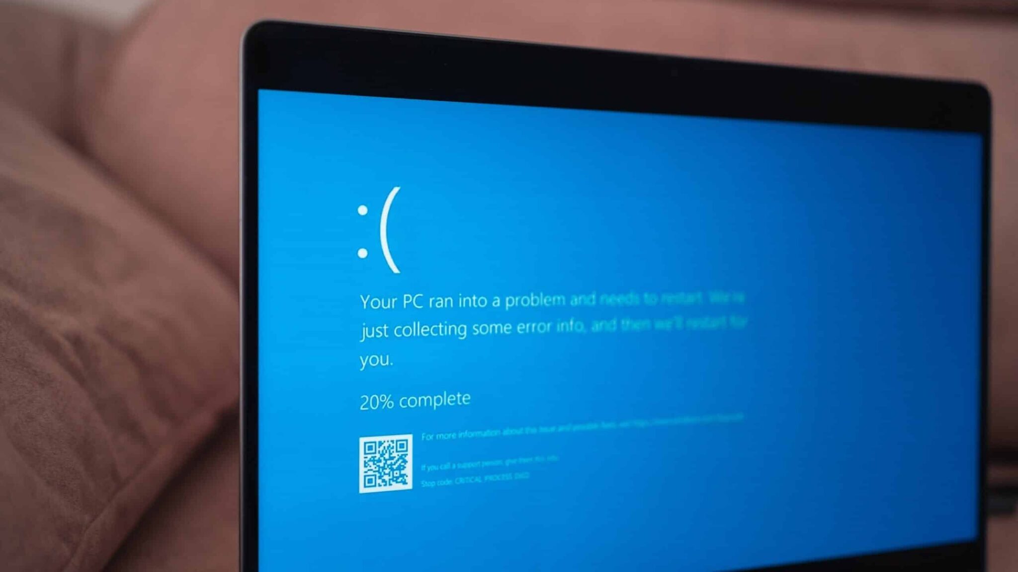
Have you ever stared in disbelief at that stark blue screen, the infamous “Blue Screen of Death” (BSoD), as your unsaved work vanishes into the digital ether? That heart-sinking moment might soon become a little less… heart-sinking. Microsoft is reportedly undertaking a significant redesign of the Windows BSoD, not to eliminate it entirely (alas, that might be a technological Everest), but to make it a more helpful and efficient tool for getting you back on track as quickly as possible.
For decades, the BSoD has been the unwelcome guest, crashing the party of your productivity with cryptic error messages that often leave even seasoned tech users scratching their heads. It’s become a symbol of frustration, a digital roadblock in our increasingly digital lives. But sources within Microsoft suggest a shift in approach. The goal isn’t just to inform you of a system failure; it’s to guide you through the recovery process with more clarity and speed.
What exactly does this redesign entail? While official details remain scarce, whispers from the development community and leaked information point towards several key changes. One significant area of focus is reportedly simplifying the error messages. Instead of the technical jargon that often accompanies a crash, the new BSoD might feature more user-friendly language, explaining the issue in a way that’s easier for the average person to understand. Imagine seeing a message like, “Your computer ran into a problem with its graphics card. Restarting might fix this,” instead of a cryptic stop code. This small change alone could significantly reduce the panic and confusion associated with the BSoD.
Furthermore, there’s talk of integrating more direct troubleshooting steps into the BSoD itself. Instead of just presenting an error, the redesigned screen might offer suggestions for immediate actions, such as restarting your computer (often the first and most effective solution) or even running basic diagnostic tools automatically. This proactive approach could potentially resolve minor issues without requiring users to navigate complex troubleshooting guides or search online for solutions while using another device.
Another potential improvement involves the way the BSoD collects and presents information. Currently, the screen displays a QR code that users can scan to get more details online. While this is a step in the right direction, the process can still feel clunky. The redesign might streamline this process, perhaps by providing more detailed information directly on the screen or by making the online resources linked via the QR code more targeted and helpful. Think of it as a more intelligent error reporting system that anticipates your needs.
The motivation behind this redesign seems clear: minimizing downtime and frustration. In today’s fast-paced world, every minute of lost productivity counts. A confusing or unhelpful error screen only exacerbates the problem. By making the BSoD more informative and action-oriented, Microsoft aims to reduce the time it takes for users to understand the issue and get their systems back up and running. This aligns with Microsoft’s broader focus on user experience and making Windows a more intuitive and reliable operating system.
Industry experts believe this redesign is a welcome and necessary step. “The BSoD has been a source of anxiety for Windows users for far too long,” says Sarah Miller, a tech analyst at a leading research firm. “Simplifying the error messages and providing more direct troubleshooting guidance can significantly improve the user experience and reduce the feeling of helplessness that often accompanies a system crash.”
While the exact timeline for the rollout of this redesigned BSoD remains uncertain, it’s likely to appear in a future Windows update. Insiders suggest that Microsoft has been actively testing various iterations of the new screen with a focus on gathering user feedback to ensure the changes are genuinely helpful.
This isn’t the first time Microsoft has tweaked the BSoD. Over the years, it has seen minor visual updates, including the addition of the QR code in recent versions. However, this reported redesign appears to be a more fundamental shift in the purpose and functionality of the error screen. It signals a move from simply reporting a failure to actively assisting users in the recovery process.
Imagine the relief of seeing a BSoD that doesn’t make you feel like you’ve just encountered an alien language. Picture a screen that not only tells you something went wrong but also offers clear, actionable steps to fix it. This is the promise of the redesigned Windows BSoD. It’s not about eliminating errors entirely, but about making those inevitable moments of system failure less disruptive and more manageable.
For many, the BSoD has become a symbol of digital dread. This redesign offers a glimmer of hope that this dreaded screen might finally evolve into a more helpful tool, a digital assistant in times of crisis, guiding us back to our work with as little fuss as possible. It’s a subtle but significant change that reflects Microsoft’s ongoing commitment to improving the Windows user experience, one blue screen at a time. So, the next time you see that familiar blue hue, perhaps it won’t be with a sigh of despair, but with a sense of “Okay, let’s see what we can do about this.”


