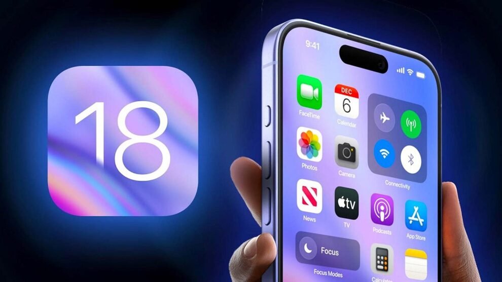
Apple’s iOS 18 has landed, and with it, a wave of exciting new features. But amidst the buzz around interactive widgets and revamped notifications, it’s the Lock Screen that’s stealing the show. This isn’t just a minor refresh; it’s a complete overhaul, offering unprecedented customization and a level of personalization that’s got iPhone users across the globe (myself included!) eagerly tweaking their home screens
Taking Control: A New Era of Lock Screen Customization
iOS 18 puts the power of personalization directly in your hands. Forget the static Lock Screens of the past. Now, you can:
- Add Widgets: Finally! Widgets aren’t confined to the Today View anymore. In iOS 18, you can add widgets directly to your Lock Screen, giving you instant access to information from your favorite apps – weather updates, calendar events, fitness tracking, and much more.
- Customize Fonts and Colors: Tweak the look of the clock and date with different font styles and color options. Match your wallpaper, create a bold statement, or keep it subtle – the choice is yours.
- Multiple Lock Screens: This is where things get really interesting. You can create multiple Lock Screens, each with its own unique wallpaper, widgets, and color scheme. Switch between them with a simple swipe, tailoring your Lock Screen to different contexts – work, travel, or just plain fun.
Wallpaper Wonders: Depth Effects and Complexity
iOS 18 takes wallpapers to a whole new dimension with depth effects. This clever feature uses AI to intelligently separate the subject of your wallpaper from the background, creating a layered effect where the subject appears to sit in front of the clock. It’s a subtle but visually striking touch that adds a sense of depth and dynamism to your Lock Screen.
But there’s a catch. Not all wallpapers play nicely with the depth effect. Wallpaper complexity plays a crucial role. Images with busy backgrounds, intricate patterns, or multiple subjects can confuse the AI, resulting in a less effective depth effect.
Here’s what I’ve learned from my own experiments:
- Simple is often better: Wallpapers with a clear subject and a relatively uncluttered background tend to work best with the depth effect.
- Portraits pop: Photos with a single person or object as the focus create stunning results, with the subject appearing to “pop” from the screen.
- Play around: The best way to find out is to experiment! Try different wallpapers and see how they interact with the depth effect. You might be surprised by the results.
Mastering the Controls: Beyond the Basics
While the visual customization options are impressive, iOS 18 also introduces significant changes to Lock Screen controls. These are the quick access buttons located at the bottom of the screen, traditionally used for the flashlight and camera. Now, you have the freedom to choose what these buttons do.
- Replace Default Controls: Don’t need quick access to the flashlight? No problem. You can replace the default controls with shortcuts to other frequently used features like Do Not Disturb, Low Power Mode, or even specific apps.
- Streamline Your Workflow: Imagine launching your favorite music app or activating a home automation scene with a single tap from your Lock Screen. This level of customization can significantly streamline your daily routines.
Pro Tip: Explore the Shortcuts app to create custom actions for your Lock Screen controls. The possibilities are endless!
Navigating the Complexity: Tips and Tricks
With so many customization options, it’s easy to get overwhelmed. Here are a few tips to help you navigate the complexities of the iOS 18 Lock Screen:
- Start with a Focus: Consider how you want to use your Lock Screen. Do you need quick access to specific information? Are you aiming for a minimalist aesthetic or a feature-packed design?
- Explore the Gallery: Apple provides a curated selection of wallpapers designed to work seamlessly with the depth effect. It’s a great starting point for inspiration.
- Embrace the Edit Mode: Don’t be afraid to experiment! The Lock Screen edit mode is your playground. Add, remove, and rearrange widgets, change colors, and try different fonts until you achieve the perfect look.
- Seek Inspiration: Check out online communities like Reddit and Pinterest for creative Lock Screen ideas and inspiration from other users.
The Future of the Lock Screen: A Glimpse Ahead
The changes in iOS 18 suggest that Apple is serious about transforming the Lock Screen into a truly personalized and dynamic hub. We can expect to see even more innovative features in future updates. Imagine:
- Interactive Widgets: Widgets that allow you to control music playback, adjust smart home devices, or even respond to messages without unlocking your phone.
- Contextual Lock Screens: Lock Screens that automatically adapt to your location, time of day, or activity, providing the most relevant information at a glance.
- Third-Party Widget Integration: An expanded ecosystem of widgets from third-party developers, offering even more customization and functionality.
The iOS 18 Lock Screen is a testament to Apple’s commitment to user experience and personalization. By giving users the tools to create a Lock Screen that truly reflects their individual needs and style, Apple has elevated the iPhone from a mere communication device to a powerful tool for self-expression. So, go ahead, dive into the world of Lock Screen customization and unlock the full potential of your iPhone.



Add Comment