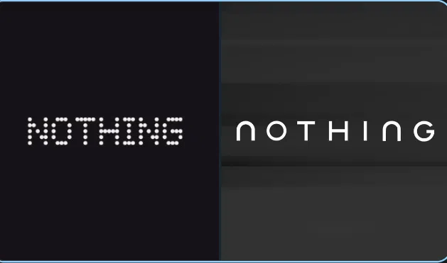
Nothing appears to be preparing for one of the biggest shifts in its short but closely watched history. The London-based consumer electronics company has ignited fresh debate across the tech community after quietly revealing a new logo on social media, paired with the statement, “GETTING READY TO MAKE HISTORY.” While the post itself was minimal, the implications feel anything but small.
Founded by former OnePlus co-founder Carl Pei, Nothing has always leaned heavily on visual identity as part of its appeal. Since the launch of the Nothing Phone (1) in 2022, the brand’s retro-futuristic dot-matrix typeface has been instantly recognizable, almost inseparable from its transparent hardware and experimental tone. This latest teaser, however, suggests that era may be coming to an end.
The newly shared wordmark is monochrome, solid, and noticeably cleaner. At first glance, it feels more restrained, more conventional, and perhaps intentionally so. While some fans immediately began speculating that the change could signal the arrival of the Nothing Phone (3) or even an entirely new AI-focused product category, the visual shift seems to point toward something broader. It looks less like a single product refresh and more like a recalibration of how Nothing wants to be perceived.
Key Takeaways
- New Brand Identity: Nothing has revealed a cleaner, more traditional logo, moving away from its well-known pixel-style “NDOT 55” typeface.
- Teaser Campaign: The company accompanied the logo with the tagline “GETTING READY TO MAKE HISTORY,” fueling speculation without offering concrete details.
- Community Reaction: Long-time supporters appear split. Some miss the analog, nostalgic charm of the original design, while others welcome the sharper, more polished look.
- Future Roadmap: The rebrand lines up with Carl Pei’s earlier comments about 2026 being a pivotal year for AI-native hardware that extends beyond smartphones.
- Market Positioning: Industry observers suggest the change could help Nothing compete more directly with established players like Apple and Samsung by projecting maturity and scale.
Nothing has built a loyal following in India and internationally by leaning into transparency, both literally in its product design and figuratively in its branding philosophy. Much of that identity was shaped in collaboration with Teenage Engineering, with the original dot-matrix logo drawing inspiration from 1980s IBM mainframes. The idea was to inject nostalgia into modern consumer electronics, and for a while, that approach worked remarkably well.
That said, the new teaser feels different in tone. The font now looks sleek and professional, arguably easier to read at a glance, especially across software interfaces and larger ecosystems. On platforms like X and Reddit, critics and supporters alike have pointed out that while the old look was distinctive, it could also feel niche. Scaling a global brand sometimes means sacrificing a bit of eccentricity, and perhaps this is Nothing acknowledging that reality.
The Shift Toward a New Design Era
Timing matters here. This rebrand arrives during what appears to be a transitional phase for the company. In late 2025, Carl Pei confirmed that Nothing would debut its first AI-native platform in 2026, a move that signals ambitions well beyond being a design-forward smartphone maker. The company now seems to be positioning itself as a broader ecosystem player, one that needs a unified, highly legible identity across hardware, software, and services.
Adopting a more traditional logo may be part of that preparation. If Nothing is indeed expanding into areas like smart glasses or other connected devices, as previous hints suggest, consistency and clarity become increasingly important. A playful dot-based logo might feel out of place on enterprise-facing software or future AI-driven interfaces.
In India, where Nothing has established a particularly strong presence, the rebrand is being viewed through a slightly different lens. The company’s CMF sub-brand and local manufacturing efforts have already helped it gain traction, and India now hosts the global headquarters for CMF. Against that backdrop, a more premium, refined visual identity could help Nothing solidify its status in a highly competitive market.
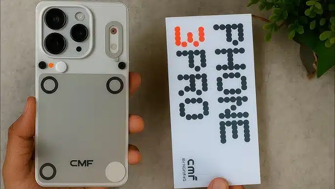
Leaks suggest that the updated branding may first appear on upcoming devices like the Phone (4a) series and the flagship Phone (3). The latter is rumored to feature the Snapdragon 8s Gen 4 chipset along with an upgraded Glyph interface, which, interestingly, remains a core part of the brand’s hardware identity despite the logo change.
The “GETTING READY TO MAKE HISTORY” message has, unsurprisingly, led to a flood of theories. Some believe Nothing is gradually stepping away from the transparent hardware aesthetic to focus more heavily on AI-driven user experiences. Others think the logo update is simply a refinement, a way to make the brand feel more timeless as it explores future categories like humanoid robots or even electric vehicle interfaces, ideas Pei has hinted at before.
Whatever the outcome, Nothing seems to be doing what it does best: creating just enough intrigue to keep people talking, while holding back the full story until the moment feels right.
Frequently Asked Questions
Q1: Why is Nothing changing its logo?
A1: The brand appears to be evolving from a design-led startup into a global tech challenger. A more conventional logo improves readability and helps the company appear more established to mainstream consumers.
Q2: Will the Nothing Phone (3) have the new logo?
A2: Based on recent teasers, devices launching in 2026, including the Phone (3) and the Phone (4a) series, are expected to feature the updated branding across packaging and software.
Q3: Is Nothing moving away from transparent designs?
A3: There is no official confirmation of that. Despite the logo change, features like TransView and the Glyph interface are still central to Nothing’s product identity.


